Artist Profile: Hergé, The Master Artist behind Tintin -
The 5 key elements of his style
Hi Friends, I’d love for this to be the newsletter where I have good news about the printing of Spirit-Girl #1, but alas, it is not. We will have to continue patiently awaiting delivery of the correct ink cartridge (the last one!). In the meantime, please enjoy this art appreciation article about master Belgian artist Hergé. Also, read to the bottom of the article for a time lapse video of some comics inking I did recently.
Hergé is a Belgian comics artist who lived from 1907 to 1983. His real name was George Remi. Hergé is the French pronunciation of the initials G. R. in reverse (R + G). He is most famous for his Tintin “Bandes Dessinés” which literally means drawn strips in French, i.e. “comics”.
Tintin is a young 20th Century Belgian adventurer whose stories involve travelling to different parts of the world (and once on the Moon) to investigate mysteries, jewel thefts, fabled lost kingdoms, murders, and so forth. On his adventures, Tintin is often accompanied by his dog “Milou”, a sailor friend (“Capitaine Haddock”), bumbling detectives “Dupont et Dupont”, and eccentric hard-of-hearing scientist “Professeur Tournesol”. The stories are a well-balanced blend of the adventure fantasy, detective, and humour genres.
I grew up in a small Acadian village¹ and so went to a french school. Though Acadians remained largely neutral to the “Seven Years War” the British suspected the Acadians of siding with the French. Tensions mounted and the British began a major deportation project which resulted in most Acadians being expelled from their land in 1755. Some ended up in New Orleans and their descendants are today know as the Cajuns. This deportation became a major defining trauma in Acadian history and still forms the Acadian identity to this day. Though the main concern of most modern Acadians is getting by in a depressed economy, much of the concern of the educated Acadians has to do with staving off assimilation. So our school’s library had a strong focus on the French-speaking world. This is why Hergé’s work along with other Franco-Belgian comics like Astérix and Lucky Luke were my first contact with the medium of comics.
In this newsletter we will look at Hergé’s art and underline the elements of his style.
Let’s learn what makes him a great artist!
Elements of the “Ligne Claire” Style
Hergé’s line work is sometimes called “ligne claire” (clear line). We can identify this style by the following characteristics:
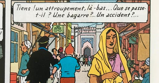
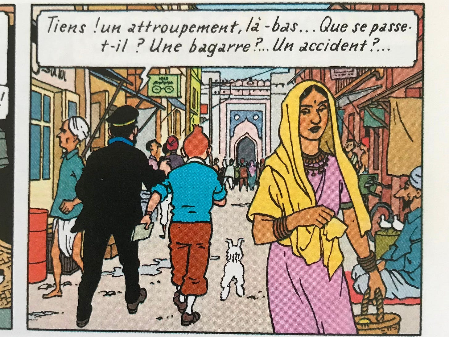
Minimal line weight variation. Though there is masterful thick to thin line work, almost all lines in Hergé’s work are more or less the same weight.
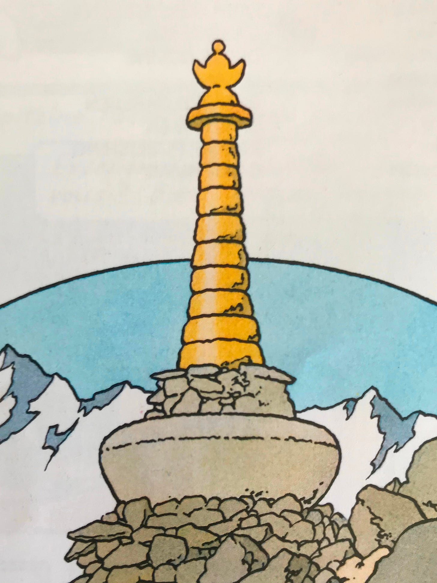
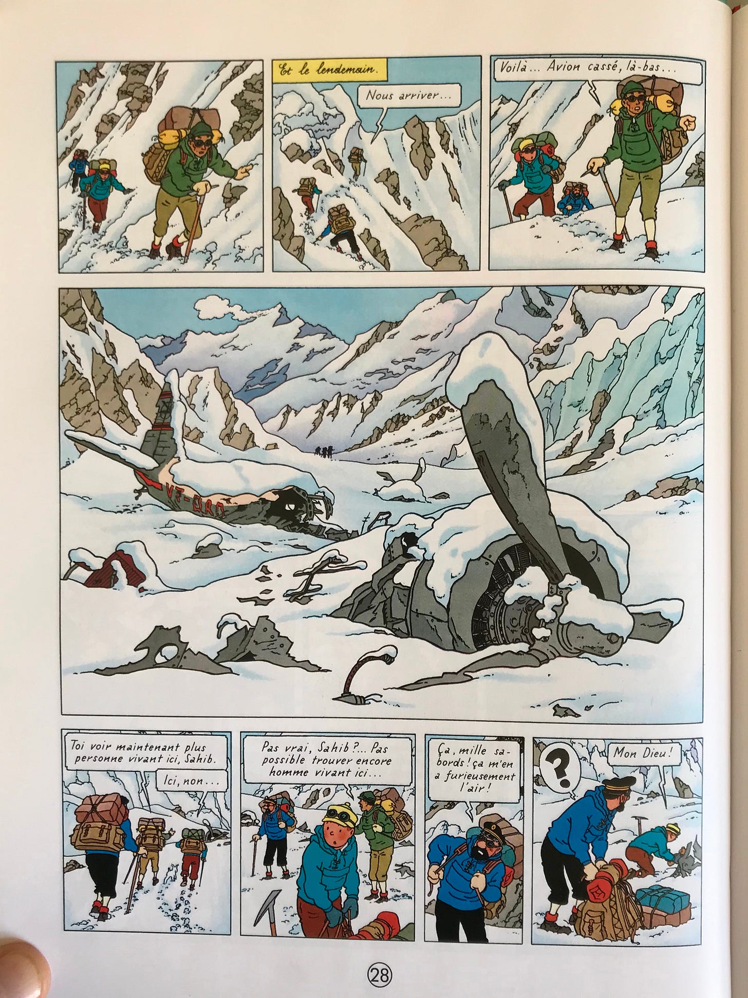
No shading or rendering. Hergé does not use any cross hatching, or any sort of line technique to indicate a light source. Everything is rendered using only outlines. Any indication of shading is exclusively done with colour. There is also no use of rendering to express shape and dimension. Instead, all outlines are left open with shape defined by mastery of outline placement. Very occasional hints of texture are drawn in.
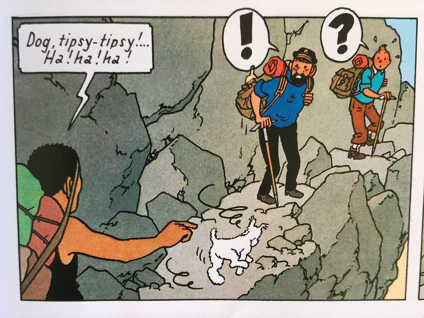
Flat colours. Though Hergé was not the colourist he was the director of his studio and as such, the colouring reflects his vision. There are no gradients (except on the characters cheeks). All outlines are filled in edge-to-edge with a single colour. Notice below how the shading on the rocks is expressed using only various shades of grey but there is no transition from shade to shade.
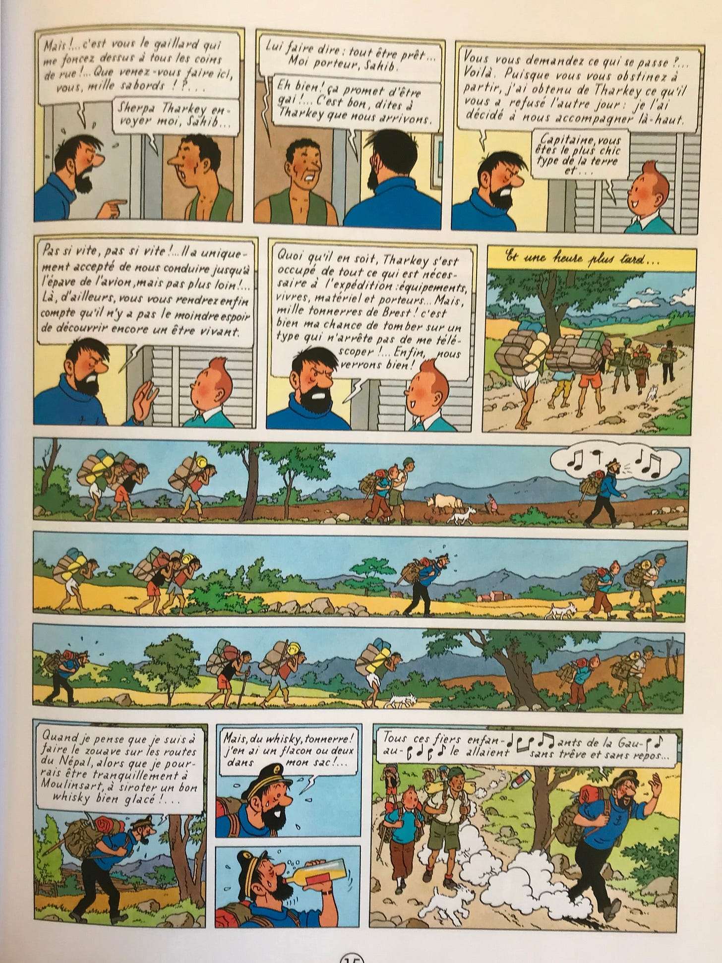
Conservative layouts. The layouts in Tintin books are sedate and solid. There is none of the flashy diagonal panels and border breaking figures found in modern American comics. Legibility is the priority down to the word balloon placements which are almost always arranged at the top of the panels and are carefully overlapped to communicate the order or speakers (the speaker who speaks first has a balloon placed further on the left and below balloons of characters who speak after the first speaker). It’s an attractive, accessible, common sense layout style.
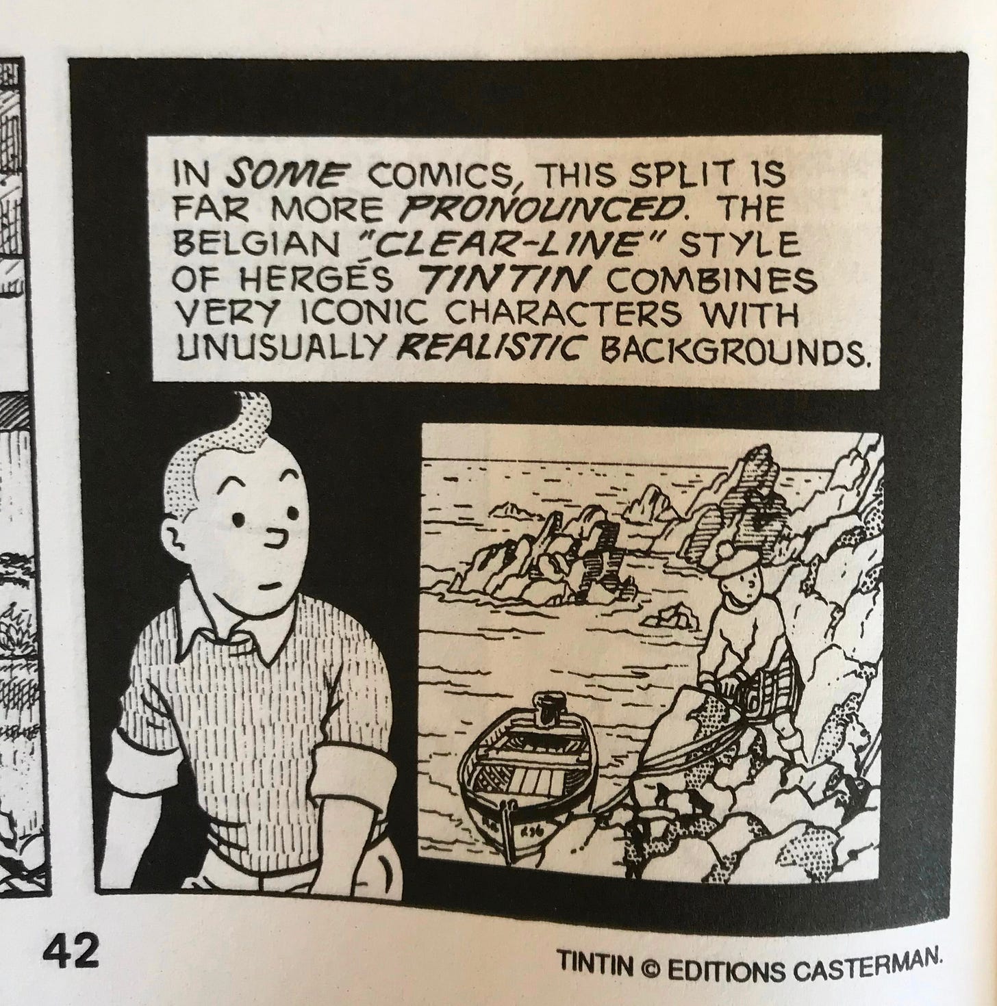
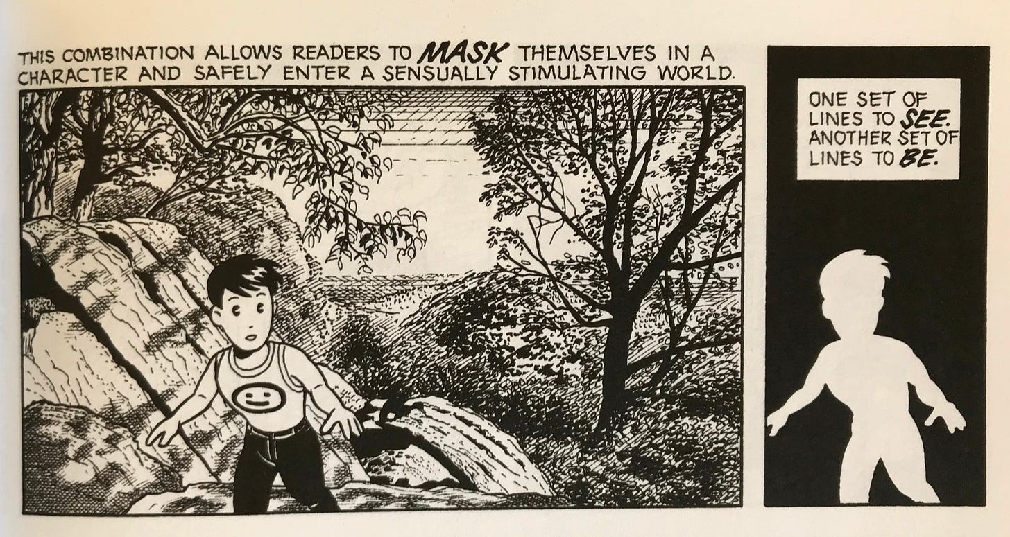
Masking. Notice how all figures, their clothing and backgrounds are detailed while character faces are highly simplified, cartoony. Scott McCloud’s Understanding Comics (required reading in my opinion) demonstrates how simplified character faces creates higher relatability to the reader. But higher amount of detail creates specificity. The result of this combination is immersion.
I have fond memories of hours on end spent pouring over these large, hardcover comics as a child. Sometimes I’d read them communally with a friend; both of us sitting on beige low pile carpet, lost in the “Adventures of Tintin”.
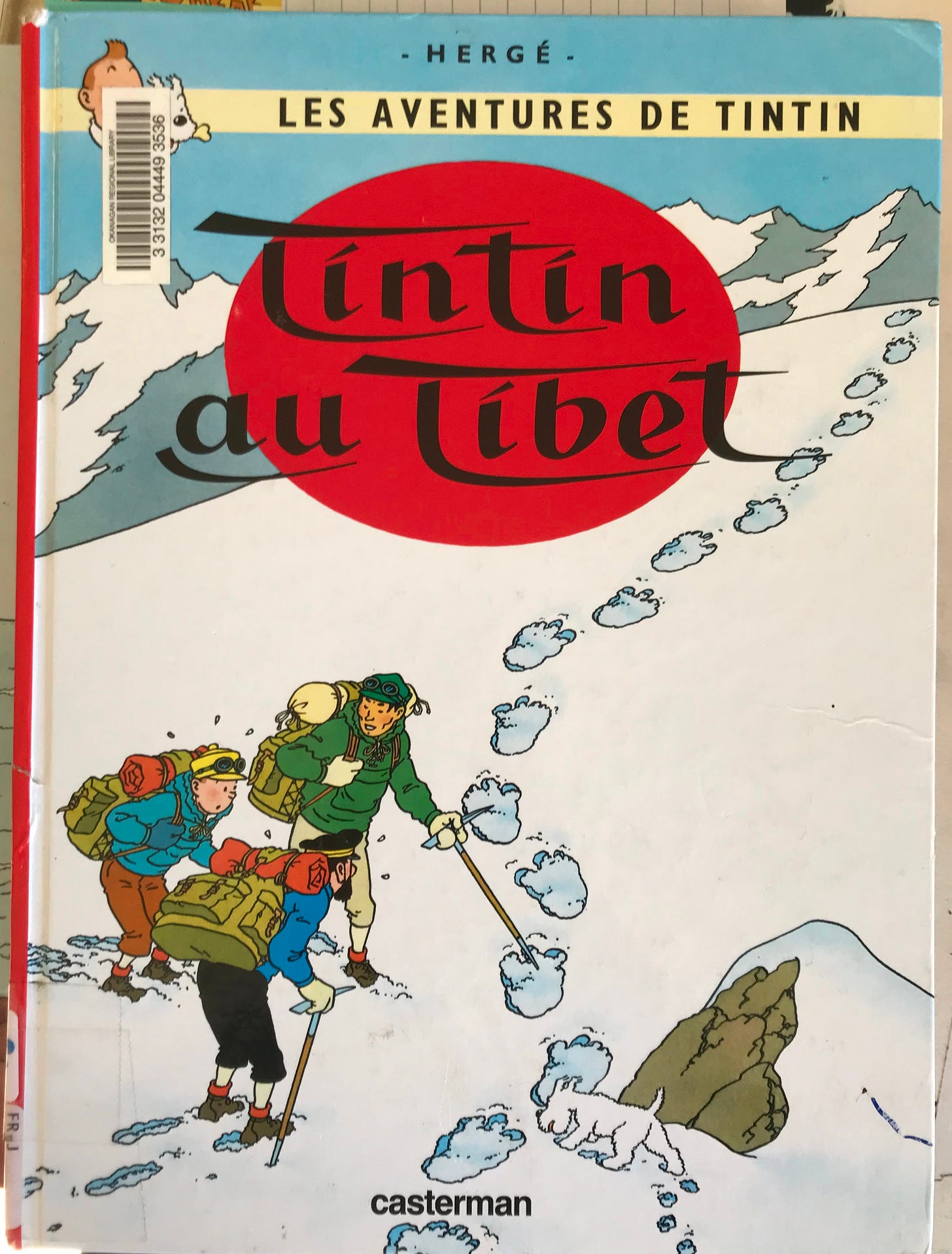
My favourite Tintin story is “Tintin Au Tibet”. Which is your favourite?
¹ Acadians are French descendents who settled in Eastern Canada and speak a French-derived creole language. The dialect I grew up speaking is called “chiac”.
Now here’s a bonus piece of content for you. It’s a timelapse of some inking I did for Spirit-Girl #2. Enjoy!



I'm not familiar with the artist's work, but I enjoyed your in-depth analysis. People don't always appreciate the artistic techniques and their purposes.
I remember these comics fondly not for any given issue but for Capitaine Haddock!
Honestly Schtroumpf was always my favourite in particular with the Schtroumpfissime (King Schtroumpf) issue.
This was really interesting, I really liked the detail and analysis you brought to Tintin here. I have to ask just ouf curiosity, do you have plans to enter the BD industry yourself? I know it remains one of my ambitions, though I'm curious as to your thoughts on such a goal rather than aiming for the English comic industry (which I do hold in high regard especially the Conan and other fantasy comics produced by Marvel, DC, and others back in the day and to this day).