


Genius or Ugly? This 90s Comic Still Confuses Everyone!
A review of Keith Giffen's Trencher

Comic Book Odyssey is completely free to all subscribers. Taking out a paid subscription helps out the project and will pay dividends in the future when paid subscriber perks are activated. You can also support by liking, commenting and sharing this with friends.
Keith Giffen passed away October 9 2023. Here are the last words he wrote on the internet.

This is how I choose to remember Keith Giffen. A sarcastic jester whose wit made it impossible for anyone to take themselves too seriously.
Keith was both a writer and artist most well-know for his work at DC where he co-piloted the Legion of Super-Heroes for many years. The Legion first appeared in the late 50s as a plot device to get Superboy embroiled in time travel. These heroes from the year 31st century became popular on their own and eventually got a title. This is where Keith made his reputation as a solid artist and plotter. With his collaborators, Keith would go on to make some beloved Legion stories such as The Great Darkness Saga and 5 Years Later. We may discuss those in later editions of this Newsletter but for now I want to focus on Keith’s most controversial post Legion work: Trencher.
Trencher is a book Keith wrote and drew for Image Comics at its apex. I wrote about Image comics and its significance here. The brief of it is that comics creators had gotten rich and famous at Marvel comics in the 90s so they took their ball and went to their newly created home, Image Comics. That era peaked and crashed quickly. But there was a period of time where the doors blew open and Keith bounced in with a comics creation that still baffles fans 30 year later. Let’s start by looking at some of the art of Trencher. Here is the cover to issue #1.
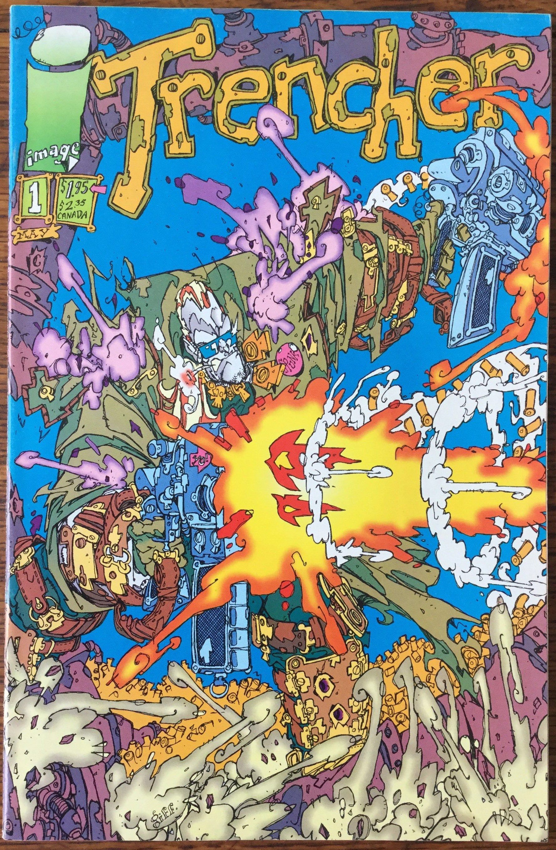
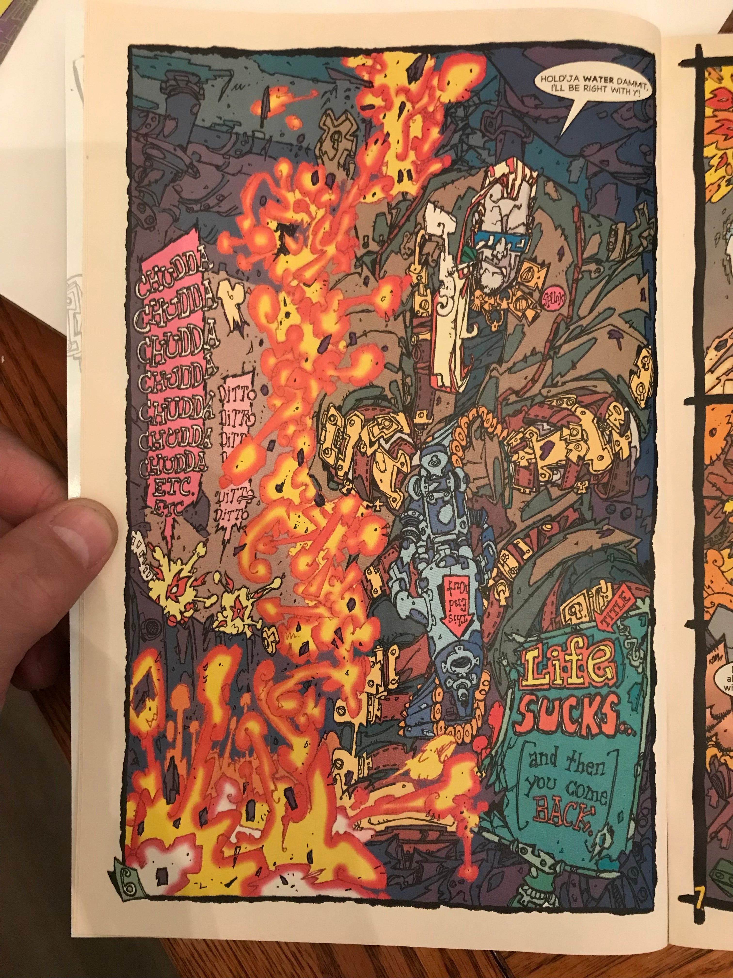
If you think this cover is busy and confusing, look at the first few pages of this book.
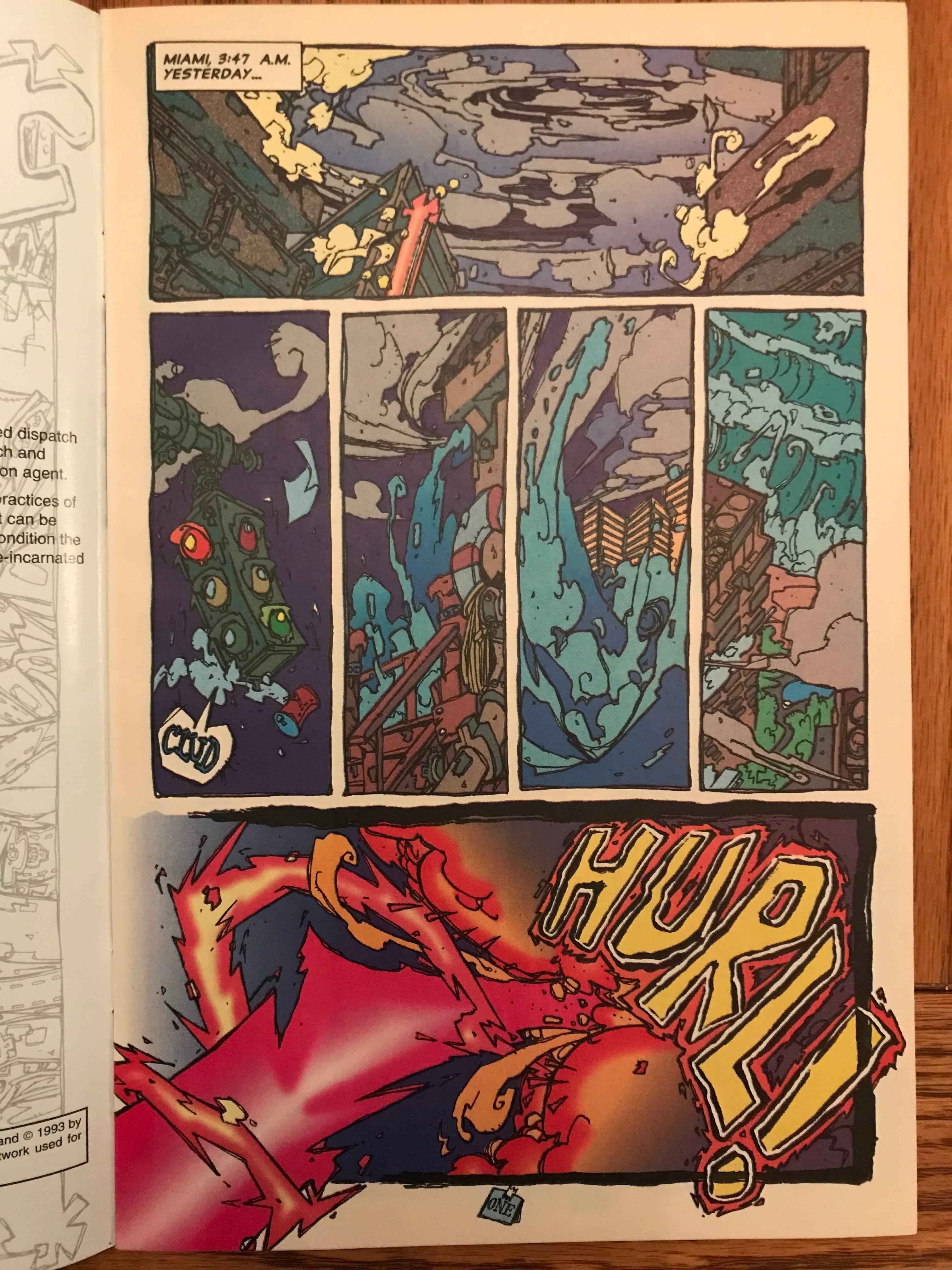
I find these pages brilliant but I’ve read them many times now. Most people are either attracted to, or put off by the art. Let’s break it down a little.
This art style uses jagged line work with little to no weight variation. In lieu of crosshatching there are a series of small intersecting lines and shapes placed over the outlines which are drawn over multiple times. Like how multi tracking in a recording studio adds texture the main track. The panel compositions mostly appear to have no single subject as if they are a series of random photos someone took while falling down. To me this is the comic book equivalent of found footage films like The Blair Witch Project, Cloverfield and Chronicle. Also present is Giffen’s fondness for visual gags such as a sound effect placed in a word balloon pointing to an object and each page number drawn in by hand.
The colors are not Giffen’s. They are credited to Digital Chameleon, a Canadian coloring studio and a pioneer of digital coloring which is now the standard in the industry. In 1993, digital coloring was new and readers were curious about the novelty. You can see in these pages what are now basic gradients in photoshop’s toolkit. This and other then new tools such as sampling and access to a wider palette were available and they were gonna use them, dammit! The result is a gloriously garish mess.
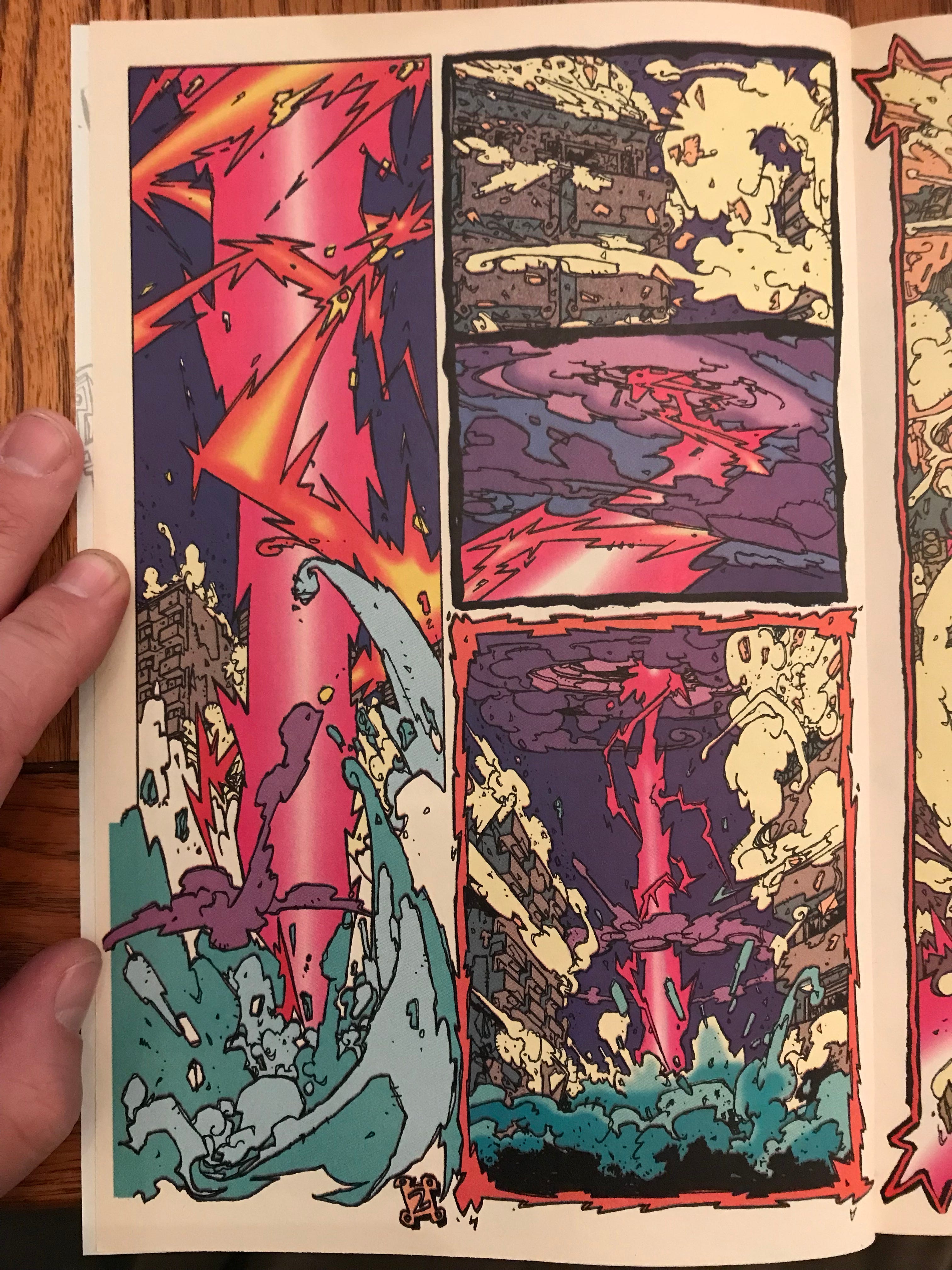
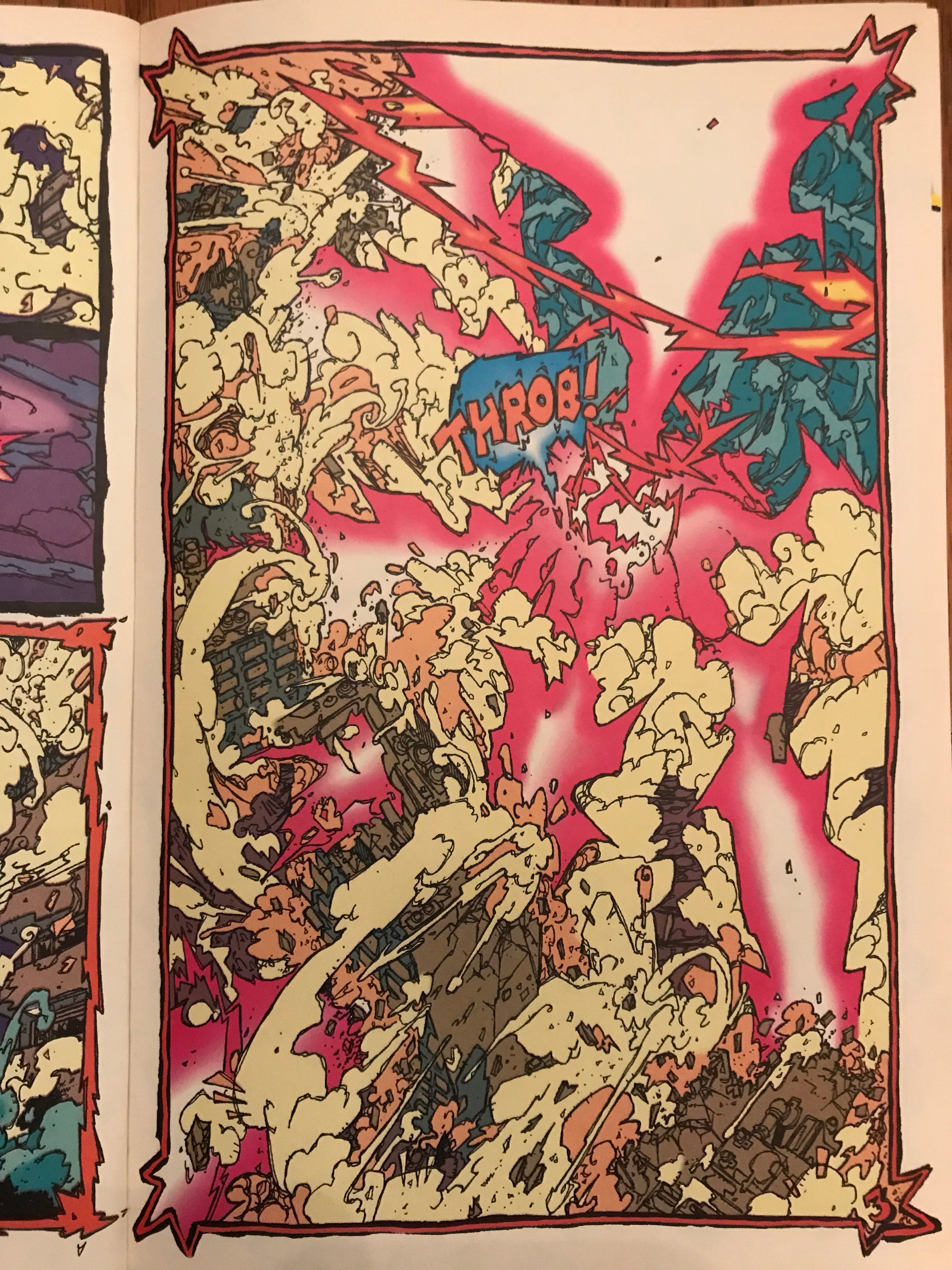
In these layouts, Instead of images representative of story moments, we have an assortment of puzzle pieces representative of aspects of an event. These sorts of layouts ask a lot of the reader’s engagement with the principle of closure as discussed by Scott McCloud’s Understanding Comics (required reading IMO).
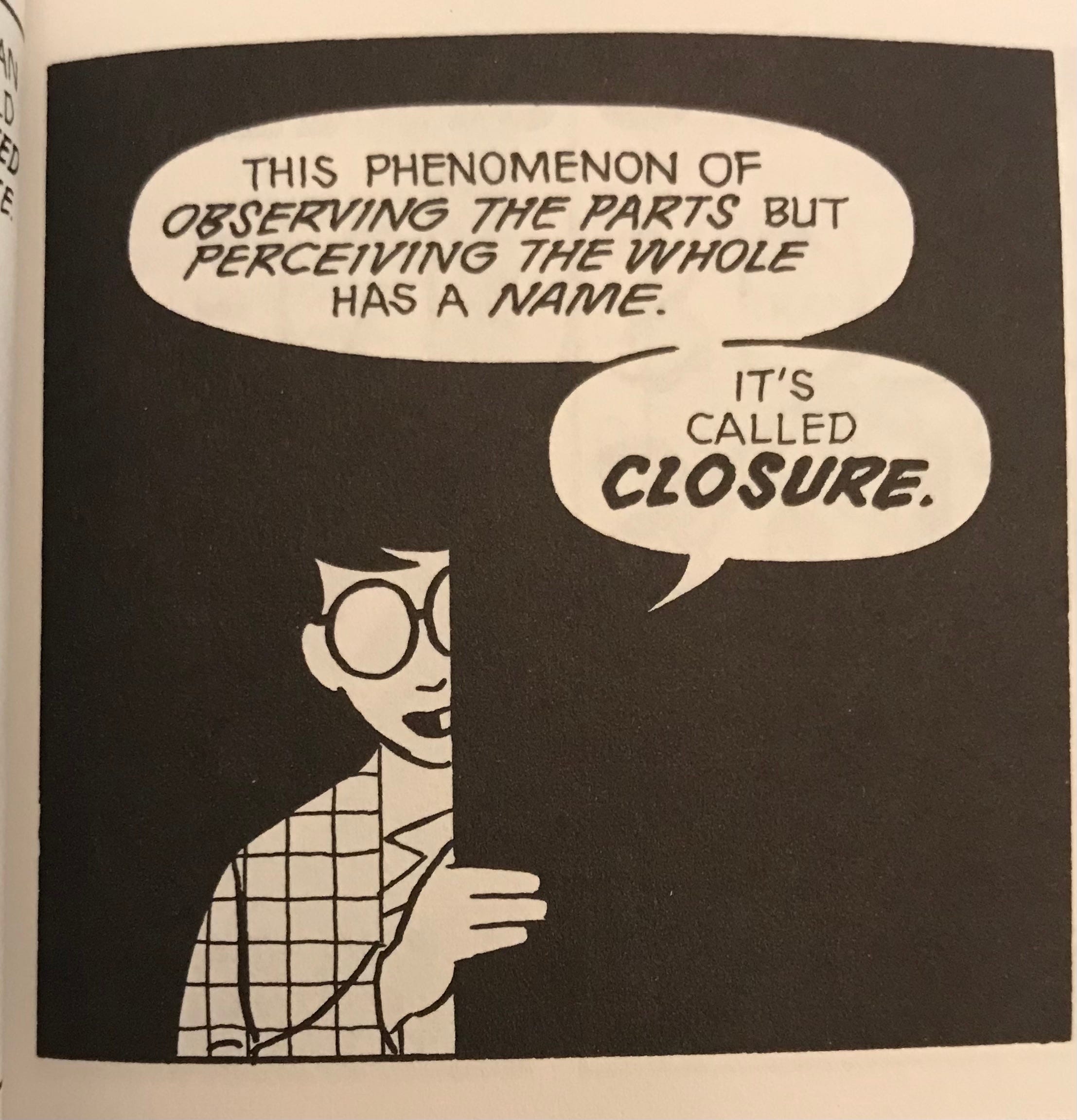
In Trencher, Giffen asks a high level of active participation from the reader in order to close the scene from panel to panel. But further, the claustrophobic shot composition and lack of line weight variation lean heavily into the closure principle within each panel. It’s like a Where’s Waldo book but instead of finding Waldo, you are finding the subject of the composition. Am I reading to much into it? Let me know in the comments.
For me the fun in reading this book is learning the language of the art style. I admit that though I was immediately attracted to the art it took me a good half hour before feeling comfortable looking at it. It is not generously clear like standard comic art is but it does become a smoother reading experience once you start getting a feel for the visual vocabulary Giffen built up for this book.
On the story side, the protagonist does eventually show up.
The Trencher character is a sort of reincarnation robot who gets sent back to earth to harvest souls who have been wrongly reincarnated. He hates his job and is good at it. Villains are equally ridiculous. Issue #1’s antagonist is The Nasal Python whose power is extensible nose hairs. Next issue’s antagonist is Cher Nobyl, a nazi-sympathizing, teatotaling cyborg grandmother. And eventually there is an Elvis inspired antagonist. It’s all very ribald, satirical and surely revealing of Giffen’s interest in Mad Magazine. In fact the whole premise of the book seems to be Giffen’s mockery of the Image Style; infinite pouches, scratchy line work, indulgent splash pages and violence as a selling feature.
Case in point, look at this ad in the Back of Trencher #1 for an upcoming Rob Liefeld book.
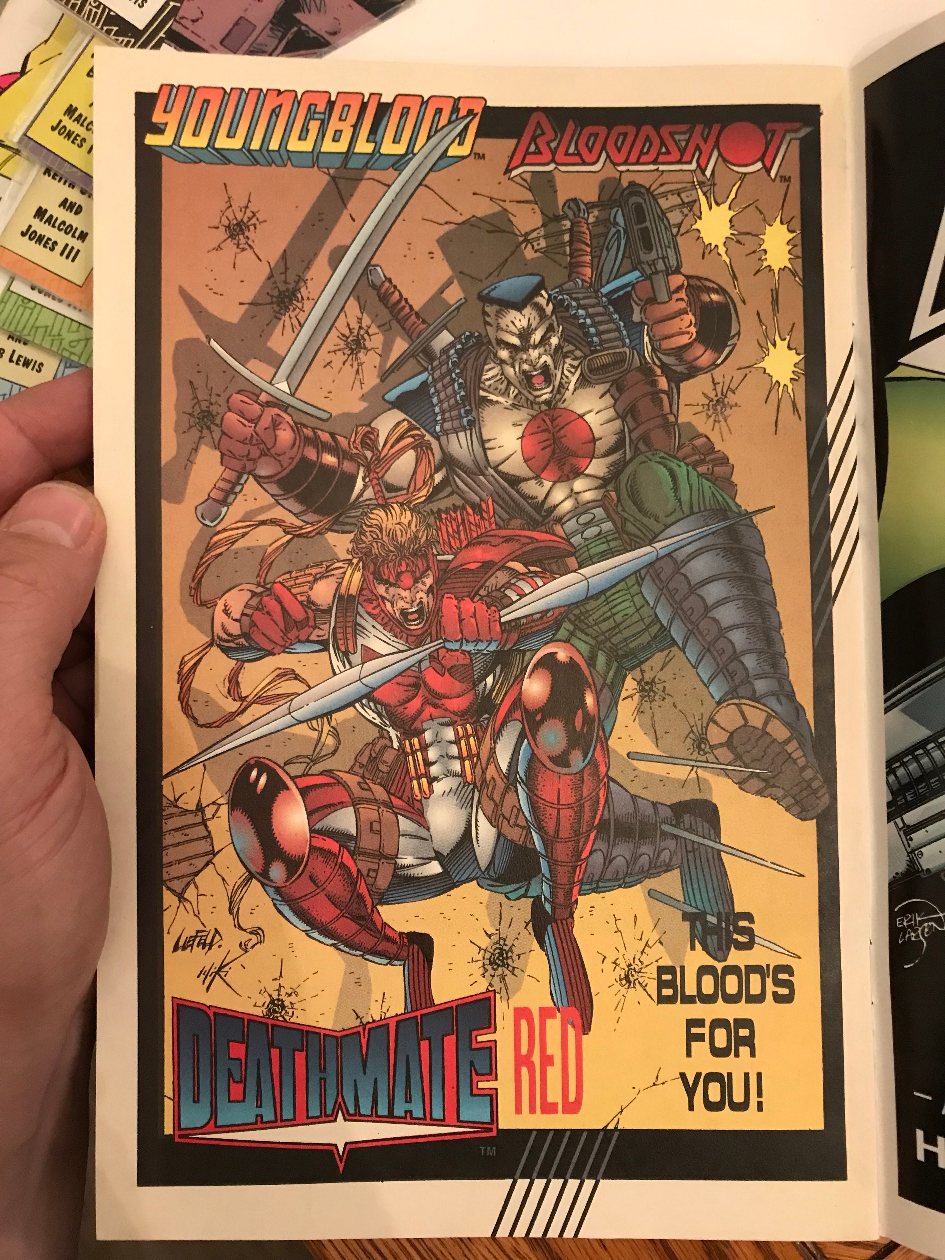
In that era Image was the hot, young guys’ turf. Giffen went in as a long-seasoned pro. I think he was putting one over on young guns like Jim Lee, Rob Liefeld and Stephen Platt by turning their schtick up to 11 and drawing it better. The audience then didn’t know what to make of it all. They probably weren’t ready to poke fun at the indulgences of the comics market which had immense hype behind it. Hype that in hindsight was clearly not backed up by much substance. But Giffen knew and with Trencher, he thumbed his nose at it all.
I studied The Trencher style a bit and learned a lot about seeing the human figure as chunks of flesh and bone instead of a light reflecting surface. Not many people know about Keith Giffen’s Trencher let alone discuss it. So I wanted to do my part in underlining this strange, gaudy book. Last week I saw issue #4 in the back issue bins and I took it out to show the guys at the comic shop. We huddled around it laughing at the bizarre images. How many books do you know can do that?
There are 4 issues of Trencher and a Holiday special called X-Mas bites. I have all of them.
I like the way you break down the artwork and style, so interesting. It is very busy and highly colored with lots to keep your eye hoping!
I remember seeing this amongst the Image comics at the local shop and passing on it, but I love your analysis of it, especially in the context of what was happening with Image at the time.